

As you can obviously see, I have updated the sites layout once again.
With the site layout, I’ve also updated my logo, and made it chromie like, ha. Well I call this entire theme Chrome. So far I like it. It’s a bit of a change from the dark creepy red and black stuff, but a good change I suppose. Many people said the bright colors stand out a bit more.
For years I ran a very popular and successful MJ site. I always used the “black n gold” color scheme on it, and loved it very much. Since I sold that site, and wont ever be doing a MJ related site again, I decided I might as well use these colors that I love. So wallah! I like it so far. It’s just weird using the colors for myself after all these years, but I love the style, and its better than letting it die and disappear I guess.
Here is the new updated logo (incase for some reason you cant already see it on the site, ha):
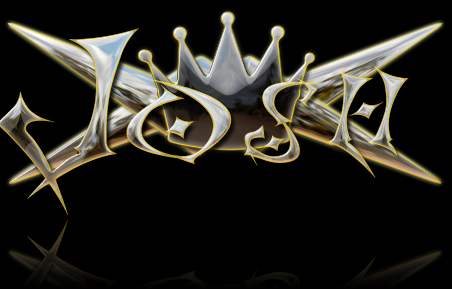
I think it looks cool.
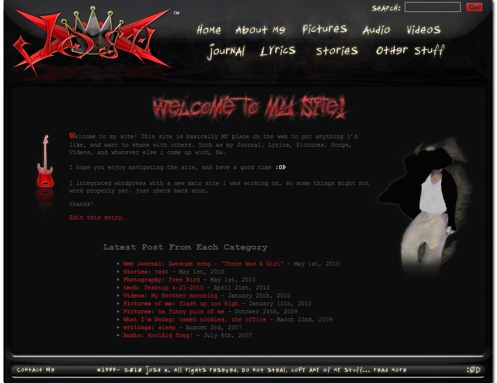
And here is the new layout next to the old (for comparison):
(click thumbnails for larger images)
Old: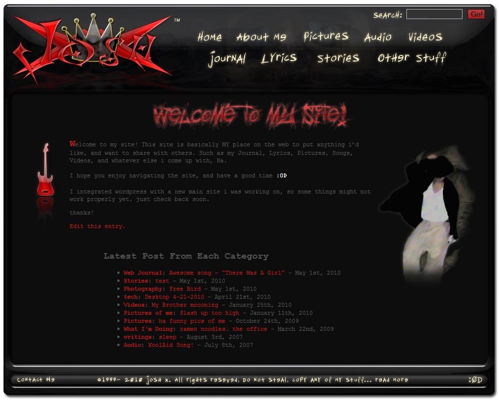 New
New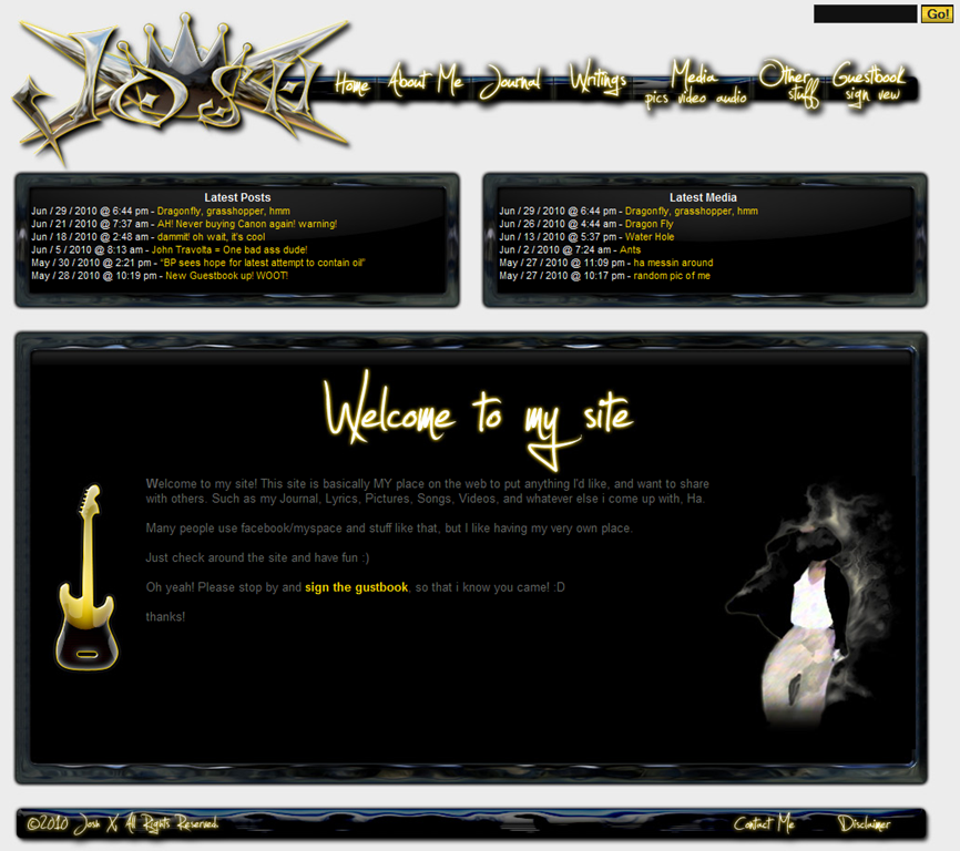
I still need to edit many of the graphics on the site, and even do some minor code work on some of the pages, so some stuff might not look right, and may even have the old red graphics on it, I’ll get to them.
Hope everyone likes the new change ![]()
